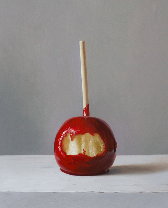
 Here is a recent painting that I photographed during the painting process to show how I work on a fairly simple piece. The painting is oil on panel and measures 10.5"x 8.5". I haven't yet settled on a name, I don't tend to like names that are too cute so "bitten" might be too much, it might just have to be "candy apple".
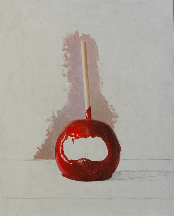
Here is the drawing, I normally don't draw this darkly because I hate having to fight my lines as I paint and pencil can be really difficult to cover up. I sort of try to scrub away the pencil with the brush, so rather than carefully avoiding my lines and filling in like a coloring book I go slightly over them and fix my drawing later if I have to. The background looks blotchy because it is a layer of paint that I have knifed on, I also sanded with emory cloth to give it a bit of a tooth or key before I started.
I am just getting started, I often paint a bit of background so that I can get the values better.
My grays are all over the place, I only mix tiny bits of color at a time. The apple is mostly Cadmium red but in order to keep some intensity in the darks I am using a bit of permanent Alizarin Crimson which I guess is quinacridone red or scarlet.
Finishing the background and starting the tabletop.
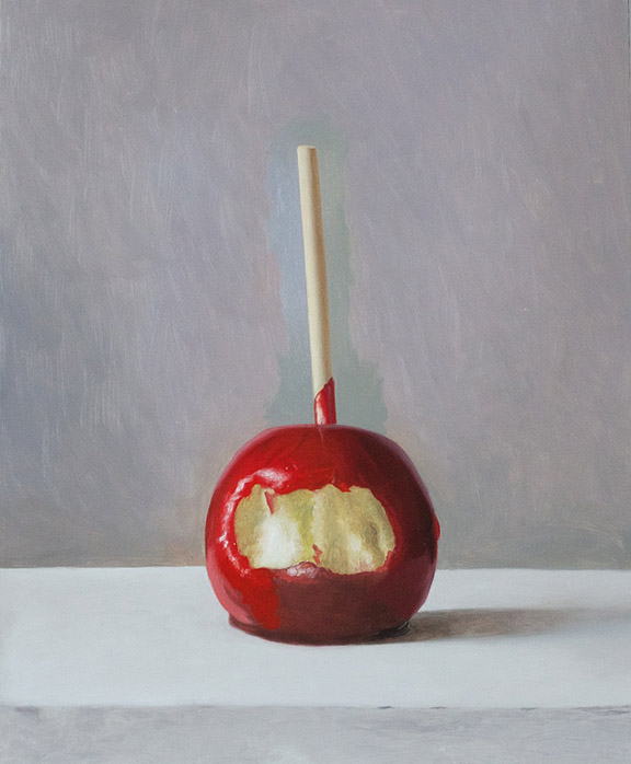
First coat finished at this point I look at the painting a lot and try and decide where I went wrong. First coat for me is really about getting the values in the right neighborhood
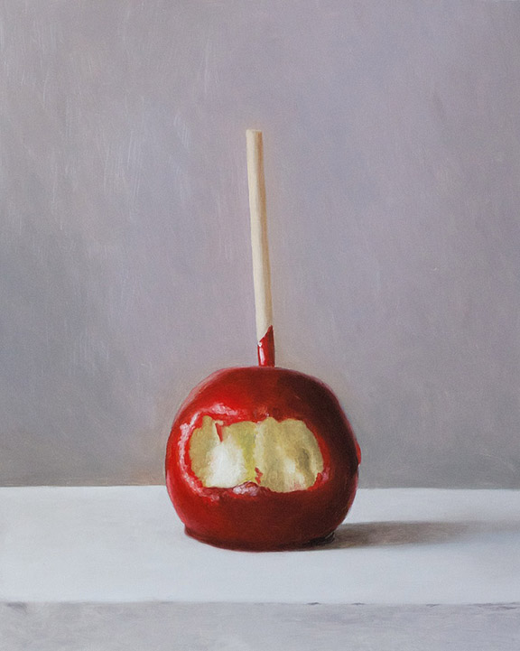
Starting next coat, the colors start being less dull and I start making a few decisions like making the background cooler rather than the warmer purplish tones. I feel like if a painting is too harmonious it feels dead, like a gauze is covering it. I am starting to draw in some of the crack details in the candy but not very carefully since I will be painting over them anyway. I do that almost as a test to make sure it will work and I wont need another strategy in order to finish the painting.
Second coat pretty much complete, everything should look pretty much how I want it to by now, it just lacks detail and some tweaks to the color.
The stick! This time I don't worry about working wet into wet because I want some crispness.
Tabletop is getting a bit more detail, but as the painting nears completion the changes are more difficult to see. I am really just refining things now. I am shooting with the light from my window onto a point and shoot of an unvarnished painting, so it doesn't look quite as good as it should. I use mostly Old Holland paints, I find that for the way I paint they are reasonably priced. They are very highly pigmented with no filler and most importantly they are stiff paints. You can get great paints like Blockx that are smoother but the stiffness of Old Holland allows me to thin my paints to any consistency without doing anything like setting my paints out on blotter paper. My medium is one part cold pressed linseed to two parts turp with a teensy bit of stand oil added for viscosity.

